Why do you do this this way??
My path through the UX discipline has been like building a design system. First, I was a front end developer, which led to curiousity as to why I was coding page elements and layouts a particular way. That led to wondering why the route we’d have users take to do what they came to a site to do, alongside the seemingly obvious revelation “Oh! We’re making these for people!” The visual display of UI elements and their attributes all had meaning and rationale, the text, for clarity for the intended audience. All very evident in hindsight, but learning the minutae of UI design, interaction design, information architecture could be very long trails to follow, so when I would reemerge, the interconnectedness of all of these aspects of design became realized. Beyond that, not only did the different elements of UX design relate to one another to form the entirety, but the ability to convey that to the developers in a way that was clear and extensible became essential. I’ve spent the latest segment of my work life focusing on this approach.
A briefing on Design Systems – gets long, feel free to skip to get to my examples below!
The user interface elements would be designed and arranged based on tradition and habit, without regard to how they related to one another or what interactions did and meant. Any screen or page full of UI elements might be discrete blocks of information and interactions without the information architecture and navigation model which helped users be able to find more information, know how to get there, and be able to easily move to that place in the application, and upon arriving, they would be greeted with a UI design, arrangement of information, and means of interaction that would be familiar based on what they’ve encountered already (as well as their own mental models of how this or any app should work).
As any designer can tell you, there are vast, Indiana Jones-warehouse-sized stores of designs that never make it into the form of a site or app, which is why we have developers. Early on, designs would be conveyed to engineering as a 1-to-1 comparison: “This page should look like this!” – and give them an annotated diagram of what goes where, often with pixel measurements and hexademical colors. But as the application design practices of larger organizations grew, the need for common standards did as well. The obvious starting point is branding, since banks love things to be in blue, but also because even on the simplest websites, there’d be more than one instance of form fields, or calls-to-action, or pop-ups asking you to sign up for their newsletter. A reasonable consistency became a realized need for applications, so design systems began evolving from simple style guides and branding guidelines.
These were initially often static documents that were updated as business needs changed, but began to have a stronger purpose with user research backing up the catalogued design systems and (thanks to the input from developers) becoming repositories of design components. On one hand, designers wouldn’t have to constantly ask the question “How should a login screen look and behave?” – barring special circumstances, they had it, could adjust for their particular scenario, and drop it into their design knowing it had been vetted internally and with testing. On the other hand, design systems became more sophisticated tools that allowed developers to either have the design components to reference available at any time, or even be able to pull the component from the repository and drop it into their work knowing it’d be plug-and-play.
So that brings us to some examples of design systems I had a significant role in creating. They’re always built on the hard work of previous designers, engineers, product folk, and so on, but I’m not only adept in doing so, I outright enjoy it.
Keysight
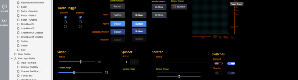
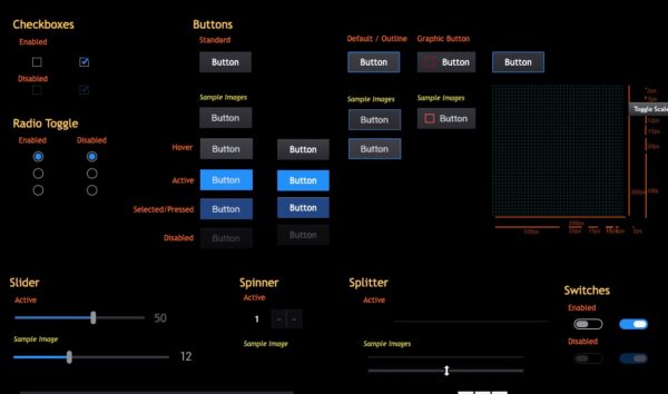
Style Guide: Basic UI Elements (Dark mode)
An early draft portion of the greater UI Style Guide driving Keysight’s PathWave software initiative:
https://zk1wqw.axshare.com/#p=basic_elements&c=1&g=0
Style Guide: Specific Components – Documentation Wizard and NEP
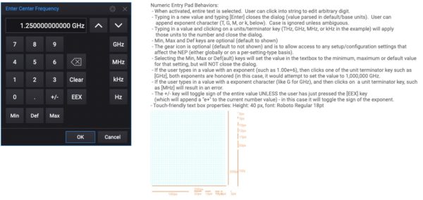
https://fkd8qb.axshare.com/#p=numeric_entry_panel
Keysight’s software ecosystem was denser than a platinum dumptruck, so building out complex components became necessary, as not only did individual applications on individual devices have elaborate functionality, we were working towards bringing them all together on the common PathWave platform. (see my Case Study: PathWave for more).
Interaction model and information architecture: Keysight Learning Systems:
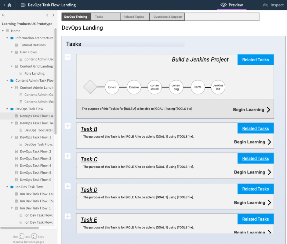
This project stands out because even though it doesn’t get to finished UI designs, I worked with the Keysight DevOps department to create a system to help onboard new DevOps folks with the enormous technology stack they used. Research into their tools and processes, environments in which they would work, the flow of what they did as DevOppers, all of this fed into how the information was architected, presented, and interacted with other nodes of info. It’s not often you get to start with a concept from the ground up – most learning systems suck. This one ended up being good, and streamlined their onboarding process a great deal.
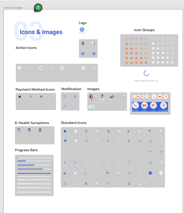
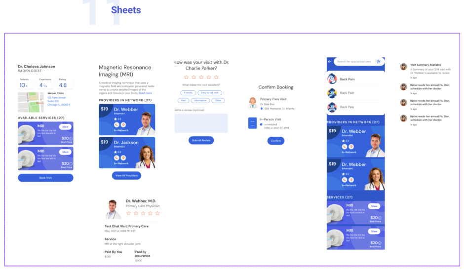
Anthem/Elevance Health
Look upon our design work ye mighty and despair!
Our design team at Anthem had a lots of leeway to explore design concepts with the goal of improving and innovating some of their more exploratory application ideas. While much of the pixels-on-the-screen work ended up in a digital graveyard, a design system began to coalesce around these efforts. No design work is ever done in vain! (We know that’s not true, but it makes us feel better to think so…)
Here are a couple of examples of early stage design system work. Don’t let the informality fool you – heart & soul were poured into these, and remained guidelines for future work.

Attempt to embed the Figma prototype in 3…2…1…
Ok, WordPress doesn’t let us embed Figma (or Axure) prototypes any longer, so please feel free to peruse this example in Figma:
https://www.figma.com/file/v2SVqLIqHd7MUC3iYEDEjB/Design.-Something.?node-id=0%3A1